How Color Trends Are Shifting—and Staying the Same—in 2020 and Beyond

The dawn of a new year—and a new decade—naturally brings out the predictions for what trends will dominate the landscape. But when it comes to color, it’s not always that simple. While some colors heat up and cool down quickly (perhaps bold hues sparked by pop culture), for the most part, shifts in color preferences happen more gradually, easing in and fading out over a number of years or even decades. 

Still, it’s important to know what’s happening, so we checked in with strategist and trend forecaster Renee Labbe, Director of Foresight Strategy at Broadside Studios, to find out what we can expect in exterior color trends during the upcoming year and beyond.

New Neutrals

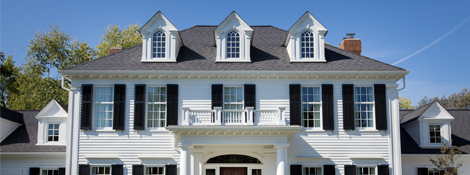
Neutral hues that began trending three, five, even eight years ago are still around as early adoption has merged into mass market appeal. And “neutral” doesn’t simply mean beiges and grays, it can mean subtle colors that are quite muted. Where colors in the ’80s and ’90s were heavily saturated, today classic yellows and creams and oranges lean closer to neutrality on the color wheel. Similarly, white is still a leading house color, but it’s a softer white, a trend Labbe says we’ll see more of this year. She also expects the appeal of contrasting whites and blacks to continue.

One of the reasons for a shift toward neutrality is lifestyle: Americans have become overwhelmed by technology and social media, resulting in sensorial chaos. Neutral tones are less busy and not as distracting, allowing the eye to rest and the brain to relax.

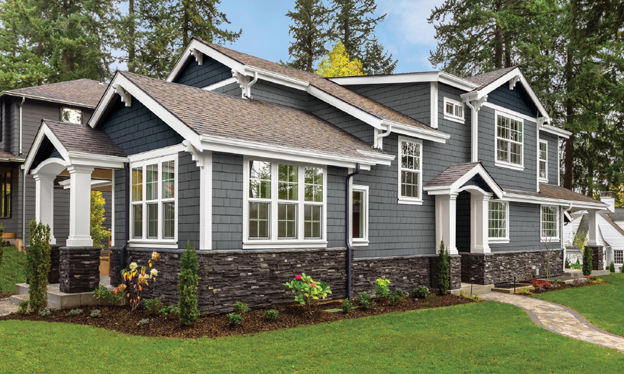
This is also likely the driver of home style trends like the Gabled Modern. This style represents simplicity, with limited use of color, material, and ornamentation, creating a sense of peace and a contrast to the “pinnacle of success” approach that has dominated real estate in recent decades. 

“Design imitates emotion,” Labbe says, noting that society is shifting as we emerge into a new decade focusing on solutions instead of division. “Neutrality is necessary as we slow down our focus. The healthy palettes start to trickle in.”

Foundry Staggered Shake in Harvest Wheat

The Rise of “Healthy” Color Palettes

Indeed, the popularity of neutrals will influence increasing interest in colors derived from nature, though Labbe says it’s too soon to know how the hues within those colors are going to evolve. “I think healthy palettes are part of a bigger trend toward ‘entanglement,’” she explains, “where we see the built environment and the natural environment literally beginning to grow into each other.”

Changing Grays

While gray has been a mainstay for a number of years, classic gray is starting to fade from favor. Instead, it’s finding its way into other colors, such as an undertone for brown that makes the rustic hue more suitable for contemporary designs without losing its warmth.  Tinted grays also are becoming more important, Labbe notes, such as gray with a hint of blue or green.

Foundry Perfection Shingle in Vintage Taupe

Reds Fading

Labbe says red undertones for exteriors, such as siding, roofing, brick, and pavers, have been downtrending and will continue to downtrend, in favor of undertones that create a more neutral feel.  For example, a brown that had a lot of red undertone will now see a gray undertone replace it; a tan would be less warm and more muted (gray undertones). 

Black Shifting

Similarly, though classic black has been popular for progressive neighborhoods, Labbe predicts some blacks with a bit of tint, such as brown-black or bluish-black. 

Above all, it’s crucial to use color correctly. A color is rarely completely “out,” but in her research Labbe often sees popular colors integrated in the wrong way. For example, combining three different grays on a contemporary house will come off stark and cold, but pairing a smooth gray stucco with wood elements can create something warm and beautiful. Gray with tan is another effective combination. 

As you design your homes and develop your streetscapes, consult with a color expert who can ensure you’re selecting hues that are on trend yet timeless and are integrated in combinations and configurations that elevate, rather than detract from, your exteriors. 

5 Best Practices for Going Bold With Exterior Color

Kleer trim

When used well, bold colors can add a tasteful pop of life to a home’s exterior. When used poorly, you can end up attracting negative attention.

Here are five tips from Trisha Wagner, senior product manager and an authority on color at Boral Building Products, to ensure your use of bold is gorgeous, not gaudy.

1. The best place for bold color is in a home’s decorative details
While it always depends on the house, bold colors are generally best used in a home’s accents, such as the shutters and front door. It’s one of the fastest ways to have a large impact and can completely transform a home’s look and feel. Even better, these details are often the easiest—and most affordable—to change later with either a fresh coat of paint or replacement.

2. Remember to coordinate
One of the first things to consider when picking bold accents is the home’s siding color. You want to select accent colors, such as on the trim, shutters, and front door, that work well with the siding, so consult the color wheel for reference. As explained on Color Matters, “color harmony” can be achieved by choosing analogous colors (three colors side by side on the wheel) or complementary colors (directly opposite each other on the wheel). This can be especially helpful in moving beyond traditional colors. For example, instead of the typical pale yellow, try a deep maize yellow paired with red, coral, or cobalt accents.

3. Pay attention to the entire home exterior
The front of the home isn’t the only area people see. Don’t forget to decorate the back and sides of a house, particularly since outdoor living is more important to buyers than ever before. A bare side or rear home exterior looks and feels unfinished; shutters and accents on these walls will add dimension and complete the look.

4. Find what works for you
If clients are uncertain about incorporating bolder colors, encourage them to experiment with different tones before making their final selection. If a home’s style doesn’t support shutters, consider using just a bold trim color. You can also soften a home’s look by pairing white or cream trim with one or two bold accents. For a less-permanent option,  incorporate bold colors into the landscape design, such as bright-red or -purple flowers and plants, a jewel-toned bird bath, or even a painted fence.

TruuExterior trim bold colors
White can be a bold choice against a neutral cladding.

5. Don’t discount the power of white
In the sea of tans and beiges that dominate today’s exteriors, white becomes a stark contrast that is a bold choice in and of itself. A crisp white trim against a richer-toned cladding is eye-catching and stands out from homes with cream accents.

For more design inspiration, visit www.kleerlumber.com and www.truexterior.com

Best Practices for Combining Exterior Colors

It takes less than 10 seconds for someone to form an impression about a house. One of the most important factors in that impression? Color.

And with a lifespan of 10 to 15 years or more, siding and accent color choice is important.

“When selecting colors, follow the 60-30-10 rule of decorating,” advises color expert Trisha Wagner, senior product manager at Boral Building Products. “Sixty percent of your color will be siding; then your accent, which may be the trim, will be near 30%; and, finally, 10% will go into shutters or another element such as a stone façade.”

When looking at a home, think about what you want to see first and where you want to have the biggest impression.

Here are general rules and factors to consider when choosing and combining colors:

Work With Home Style and Period
To achieve the right look and feel, it’s important to understand the limitations of a home’s style and choose colors that align with the architecture and time period.

For a home with natural-finish cedar siding, for example, a more neutral trim and shutters will help maintain a traditional Colonial style, while bolder accent colors such as green or brown will give it a Craftsman-like look.

Take Cues From Existing Design Elements
For homes with existing stone or brick or those looking to add this element, Wagner offers this tip: To highlight or make the stone stand out, pair with a paint color that incorporates minor undertones from the stone. This will help draw it out and give a more dynamic appearance. Conversely, to make the stone or brick blend in, find a siding color that is more similar in tone.

Further tie these elements into a home’s look by matching the trim to the grout color of the stone or brick.

TruExterior Siding and Trim
Complementary colors in the siding and stone help the stone stand out without one element overwhelming the other.

Consider the Role of Nature and Lighting
Consider how landscaping will contrast and complement the look of a home. Houses with mature landscapes and shrubs with vibrant greens and other colors will draw the eye down. Be aware of what colors you or the homeowner will plant and how that relates to the colors you’re selecting for the home.

For homes that don’t have a lot of landscaping, consider brighter siding. For those with a denser landscape, you may want to consider darker colors for more contrast.

Landscaping can also influence lighting if a home is heavily shaded by trees or natural topography. Wagner advises to look at the direction the home faces and where the sun hits at various times of day to understand how the color may change.

TruExterior Siding Fine Homebuilding ProHome
On the 2016 Fine Homebuilding ProHome, the entry area offered the perfect place for a pop of bold color, modernizing the look without taking away from the farmhouse vibe. It also provides a focal point since the home has limited landscaping.

Consider What’s Trending
For the last five years, shades of gray have been the most popular choices for a home’s exterior. Homeowners inspired by the versatile neutral are frequently selecting varieties and combinations like green-gray, greige, and blue-gray.

Dark, rich jewel tones, such as sapphire blue, are another common selection for home exteriors. Colors in this family are typically paired with white trim, particularly on the ever-popular Craftsman-style homes.

For the indecisive homeowner or buyer, Wagner says neutral bases and black and white accents are a safe option that will stand the test of time.

Another growing trend on new construction home exteriors has been mixing textures, such as combining shake and traditional siding with brick and stone for a variegated look.

Grayne siding
Gray is a trendy choice that never goes out of style and pairs perfectly with crisp white trim.

Avoid Common Mistakes
The easiest way to avoid color mistakes is to consult the color wheel.

“It’s the same color wheel you played with in kindergarten,” Wagner says. “There are still complementary and contrasting colors, and that should be your ultimate guide.”

But you have a lot of flexibility, she adds, with the variety of tones available.

Before committing, get sample pieces of the siding colors being considered. Have your buyers put them up for a few days—perhaps on the weekend when they can see in the light at multiple points across the day—to see how they look.

TruExterior siding
When in doubt, black and white is always a classic combination.

In the end, “personal preference is the ultimate guide,” Wagner says. “A home’s color is highly personable and a definition of the homeowner’s style, so give it the time and attention it needs.”