The Hottest Color Trends for 2024

Color Trends for 2024, mood board, earthy shades

Home decor trends forecasted for 2024 focus on unique color pairings that balance joyful, attention-getting tones with timeless hues that are more subtle. This combination of dynamic and refined shades offers plenty of interior design inspiration, from paint colors and fabrics to building materials and trims.

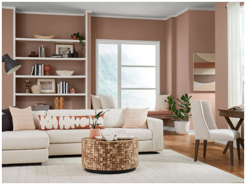
Earthy shades will continue to spark interior design ideas but with added warmth. For instance, instead of home interiors heavy on white and beige, imagine palettes of taupe and greige, a combination of beige and gray. These colors offer a versatile backdrop for you to experiment with bolder shades and accents, injecting more personality into spaces.

Here are some other predicted color trends for home interiors and exteriors:

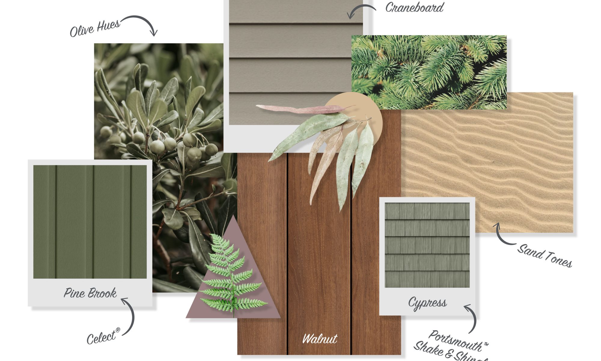
  • Warmer natural tones: Earthy and natural tones are still the go-to choices for creating grounded, soothing environments. But instead of just deep or light browns, look for colors such as terracotta, olive green, sage, and nutmeg—hues reminiscent of organic, natural elements such as sand, clay, wood, and stone.
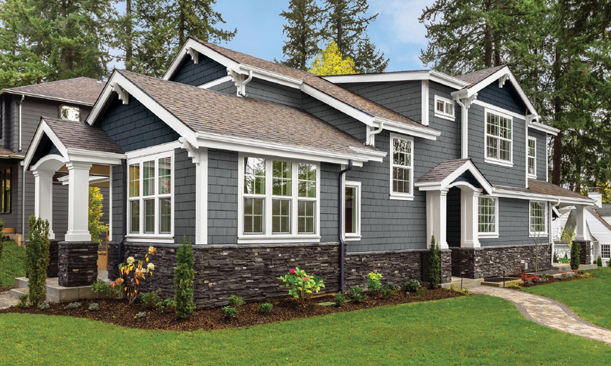
  • Moody, dramatic color palettes: Adding charcoal gray, deep navy, forest green or black to cabinetry, furniture, or accent walls creates drama with coziness, experts say.
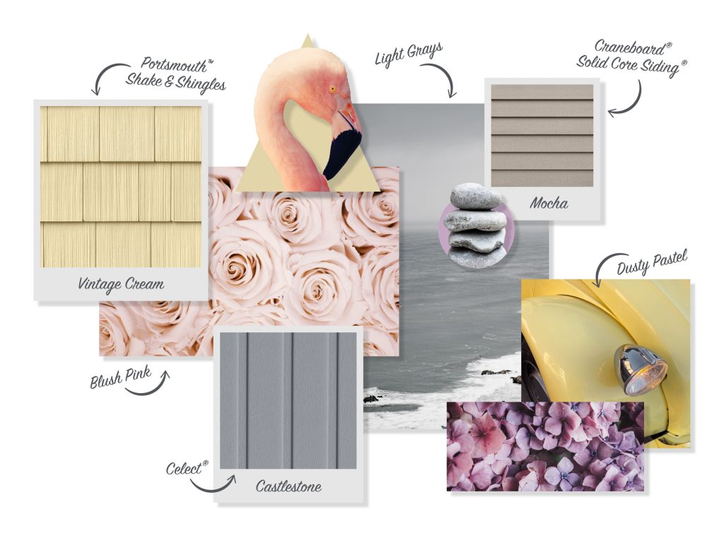
  • Lighter shades of calm: Creating a sense of tranquility at home is still top of mind, but instead of blues and greens for calm, expect more blush pink, dusty pastels and light grays.
  • Color combos: Combining autumnal and romantic hues such as mauves, browns, and greens with brighter blues, reds, and fuchsias adds a modern twist to vintage tones.
  • Bold accents: Artwork, furniture, accessories, and upholstery are prime spots for energizing colors to pop against an overall neutral color scheme. Watch for rich jewel tones such as sapphire and emerald; vibrant citrus hues such as yellow, lime, and apricot; and electric blues.
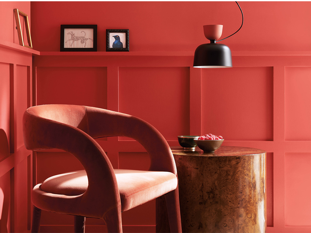
  • Jolts of joy: Whether used in accessories, upholstery, or exterior paint colors for trims and accents, designers like fiery reds, fired brick, violet, magenta, sharp green, rich purple, tropical blue, and golden green.
  • Subtle, complementary tints and tones: Look for deep forest hues, versatile tans, ethereal grays, deep grays, and fresh off-whites.

(See Also: Color Palettes Inspired by Winter)

Color trends for 2024, mood board showing shades of calm, including blushes and grays

What Is Informing Color Trends for 2024?

The pandemic inspired a desire to create more calming, restful spaces, but other factors have been driving home renovation trends recently. For instance, an interest in sustainability has spurred a yen for nature-inspired aesthetics, along with minimalist color schemes. Rapid shifts in the economy, society, and technology also play a role, with consumers craving a subtle ease and a way to balance contemporary design and timeless elegance.

Experimenting with different color pairings, such as splashes of vibrant hues with classic tones, is a way to explore creativity and infuse energy and imagination into our space.

Color Trends of 2024, mood board showing pops of joy, including rich browns and pinks

How Can I Use Color Trends for 2024 in Home Designs?

Colors set the atmosphere and tone of a space, impacting our emotions and our well-being. Some hues can even influence a space’s functionality and productivity, such as using muted blues or greens in a home office to promote concentration and focus.

Here are a few ways to incorporate 2024’s color trends into home remodeling ideas:

  • Wall paint: Creates a backdrop for other design elements with a solid foundation for an overall color scheme.
  • Furniture and upholstery: Makes a statement, creates a focal point, or adds personality and visual interest through colors and patterns.
  • Accessories and decor: Rugs, pillows, curtains, artwork, and other smaller decorative accents easily update a room’s aesthetic on a budget.
  • Cabinetry and built-ins: The finishes on cabinets in kitchens, bathrooms, and mudrooms can add depth and texture, such as covering cabinets in beadboard.
  • Accent walls and statement pieces: An armchair with vibrant upholstery can create an impact just like an accent wall in a trending color or a different finish, such as Versetta Stone or shiplap.
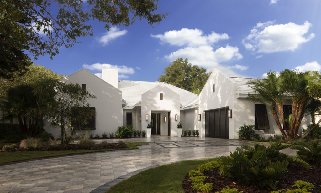
  • Exterior elements: Exterior remodeling elements such as paint colors, siding, trim colors, shutters, lighting fixtures, and landscaping boost curb appeal and set a cohesive design tone.

(See also: Easy Ways to Add Color to Your Home Exterior)

Whether you’re ready to jumpstart 2024 with a fresh color palette or aren’t sure where to begin, Westlake Royal’s Visualizer Tools give you an idea of what a completed project can look like before you begin. Play with colors and experiment with textures to create the perfect combo that reflects each home’s style.

Want more insights into design trends, product installation, and more? Subscribe to our enewsletter.

Sources:
https://thefashionfrill.com/fashion/key-color-trends-of-2024/

https://www.pantone.com/articles/fashion-color-trend-report/new-york-fashion-week-autumn-winter-2023-2024

https://www.builderonline.com/design/interior-finish/move-over-neutrals-color-to-make-its-return-inside-homes-in-2024_o

How Are Color Trends Shifting Into 2023?

Westlake Royal Roofing Solutions

Color permeates every aspect of our lives, sometimes temporarily and sometimes permanently, and often plays a critical role in our emotional, mental, and even physical state. Few places is that more evident than in our homes: inside, color sets a mood and makes a personal statement; outside, it sets the tone and nurtures a lasting impression.

Perhaps that’s why we as a society are so invested in color trends. Each year, paint manufacturers and color specialists release their “Colors of the Year,” a bit of a pulse on the consumer psyche (see our coverage of this year’s announcements here).

Color trends for homes don’t move as fast as industries like fashion and automotive. But they still ebb and flow, delivering a look into the tastes and preferences of new-home buyers and DIYers alike.

We checked in with two color experts—Renee Labbe, director of design strategy at Los Angeles-based Broadside Studios, and Kate Smith, color expert and president of Sensational Color—to see what’s on the mind of American consumers as we head into 2023.

Ongoing Macro Trends

Labbe notes that we’re under the umbrella of three ongoing macro trends, with each evolving in its own right. (These trends are based on research conducted by Labbe and Broadside focusing on roofing as a core element as part of an extensive Westlake Royal Roofing Solutions research initiative to understand what is influencing home design and roofing preferences today, so as to refine roofing offerings and respond directly to customer wants/needs.)

Naturalism: Naturalism represents how we connect to the environment and comes through in natural colors and palettes you might expect. But within that, Labbe is seeing a trend toward more nourishing colors that are rural-inspired and create a contemporary escape. The simplicity and elegance of trendy blacks isn’t going away, for example, but is making room for dark greens, weathered looks, and rustic reds.

Ease: Emerging around 2015-2016, Ease represents a move toward simplicity as a real-life antidote to our hectic online lives and frenzied social media airs. “If you’re getting constantly hit with images and details and you look up from your phone and see a space that’s clean and simple … the palette is one to two colors as opposed to five to six,” Labbe says. “This trend is a way for your eye to take in the totality of a look without having the take in all the bits and pieces of a design because it was so simplified. … And your brain relaxes.”

Glamour of Opposites: Around 2016, we started to see a simultaneous trend that was a bit more in your face, a mish-mash of traditional and modern, with blocky and curvy existing side by side. This aligns with a time when consumers began making their voices heard as well as business disrupters like Uber and Door Dash. “We’re seeing this ability to change the old guard, change the system and reinvent it in a way that works for the people,” Labbe explains. “Design became this place where we could express an explosion of creativity.” On the exterior, this trend is coming through in the form of what Labbe describes as disruption and merged aesthetics. For instance, in a “clean traditional” or “quiet modern” style, the elevation remains traditional, but in a way that’s ornamented and with a palette of color choices that’s more modern or contemporary. There’s also more neutrality in color, with a two-color palette versus a traditional Craftsman home that may have three to five saturated tones. Today’s neutrals are high contrast, such as white with a strong black, brown, or gray.

Westlake Royal Roofing Solutions
The pandemic has dramatically shifted home architecture preferences as consumers needed to use their homes in more ways than ever before. Photo courtesy of Westlake Royal Roofing Solutions.

This also shows in a blending of styles, such as a traditional façade with modern elements built in, a home with gabled roofs but a box-shaped entry, or a remodeled home with a traditional style original paired with a modern shape with similar colors to ensure cohesiveness.

Tips For Using Color Trends

When considering color trends, Smith explains that it’s important to approach reports like a menu—browse, pick a color as shown, or customize it to suit your tastes. “Use the color as your inspiration point,” she says. “If you want to use it exactly, that’s fine, but there may be similar tones that fit your home better.”

As Labbe mentioned, color trends last longer than we often think, especially in the home space. Gray, Smith points out as an example, isn’t as “hot” as it was a few years ago, but remains popular. Blue-green continues to attract the eye (and can be found in PPG’s Color of the Year Vining Ivy) and goes great with neutrals as an accent on the exterior or front door.

In fact, Smith says consumers don’t need to be overly concerned about using a trending color for fear it will become quickly dated. What puts a timestamp on it, she explains, is the combinations of colors. Think chocolate brown and aqua from a few years ago—it was the way that everyone was using them. “When looking at how to use these trends, use them in a way that no one else is using them, and then you won’t have to worry about looking dated,” she advises.

Trends are fun, Smith adds, but consumers are much more willing to go their own direction today. “In the end, trust your gut.”

2023 Color of the Year Selections Reflect Life After the Pandemic

Each year in late summer and fall, major paint companies release their “Colors of the Year” for the following year. These hues represent how each company’s in-house experts interpret the consumer pulse—our emotions, design motivations, influences, and more—and how color selection influences our lives and lifestyles.

While the color reveals are interesting in and of themselves, they provide our industry with a view into the hearts of our customers and a look at how their color choices may shift, or need to be shifted, in the process of navigating the latest trends and tastes.

Not surprisingly, the pandemic has had a tremendous influence on the color trends of the past few years, with many choices seeming to focus on relaxation and tranquility, or perhaps a little brighter for a feeling of positivity and optimism. This year’s selections continued to feel that global impact, but with varied interpretations of how consumers will feel going forward. Of the four colors shown below, two are bold and two are soothing. And perhaps both approaches are appropriate today, as Americans continue to navigate a post-pandemic norm in very different ways.

Here’s a look at a few of the Colors of the Year for 2023.

Benjamin Moore: Raspberry Blush

Benjamin Moore made a big move this year, shifting from 2022’s subtle October Mist, a silver green, to 2023’s vibrant Raspberry Blush. “A vivacious shade of coral tinged with pink, Raspberry Blush enlivens the senses with an electric optimism,” the manufacturer says. The “charismatic,” “unapologetic” shade is saturated and impactful, designed to be bold and make a statement.  

Benjamin Moore 2023 Color of the Year
Photo courtesy Benjamin Moore

The remainder of Benjamin Moore’s Color Trends 2023 palette, including Conch Shell (a dusty but rich pink), Savannah Green (a rich ochre with balanced green and yellow undertones), and North Sea Green (a deep teal with gray undertones) “was chosen for its distinct presence and personality,” the company says.  “Each of these eight confident hues offer inspiration and creativity, while encouraging a push beyond the traditional to experience truly exceptional color.”

Sherwin-Williams: Redend Point

In contrast to Benjamin Moore’s bold color, Sherwin-Williams’ 2023 Color of the Year leads with “warmth and intrigue.” Redend Point, an earthy brownish-pink reminiscent of clay earth and walls of the desert west, is described as “soulful yet subtle.” And while a more calming hue, the company says it represents moving forward and looking ahead, connection and care.

Sherwin Williams 2023 Color of the Year
Photo courtesy Sherwin-Williams

Behr: Blank Canvas

Behr’s 2023 Color of the Year is Blank Canvas, a “hopeful, warm, and welcoming white” the company says will answer homeowners’ need to create retreat-like spaces that feel restorative. At the same time, the company says the color is designed to be versatile. “The color works in both private and shared spaces and can work as a focal color or a foundation to build on for more layered spaces,” Behr says.

Behr 2023 Color of the Year
Photo courtesy Behr

Research showed that the hue would be in demand in 2023: “According to a survey of more than 1,000 U.S. homeowners, 63% of people agree that the color white is mood-boosting, and 77% say it makes them feel positive,” Behr reports. “Homeowners also say they want their home to be a space where they can unwind and destress, according to the survey, needs warm whites like Blank Canvas can help fulfill.” 

PPG: Vining Ivy

PPG joined Benjamin Moore with a saturated statement hue, Vining Ivy, a deep Caribbean aqua, as its 2023 Color of the Year. The manufacturer says the color is classic and elegant, and it works with a variety of styles.

PPG 2023 Color of the Year
Photo courtesy PPG

“Resilience, the need for connection, and inspiration from nature were recurring themes at the Global Color Workshop,” PPG says. “This annual event brings together more than 30 global color stylists from the automotive, consumer electronics, aerospace, and home paint and stain industries. Over the course of several days, the stylists analyze the runway, lifestyles, demographics, geographies, global events, and cross-cultural societal inspirations to determine what colors will resonate and represent that year, including the 2023 Color of the Year.”

Along with predictions from paint manufacturers, the design community highly anticipates the annual announcement of Pantone’s Color of the Year, which is due out in early December. What will follow the color expert’s hopeful yellow-gray duo in 2021 and this year’s creativity-inducing Veri Peri (a dark lavender)? Stay tuned.

Tips and Trends for Choosing Exterior Colors

Royal Siding and Atlas Stone on farmhouse

Whether styled in classic colors that never fade from favor or featuring trendy pops of color, the exterior façade sets the tone—and critical first impression—for the home. With tastes changing at a near-constant rate, what’s the best way to choose exterior color combinations that meet today’s needs without feeling dated quickly? We checked in with Kate Smith, color expert and president of Sensational Color, to get the latest tips and tricks for exteriors.

What Colors Are on Trend?

As often happens with exterior trends, some familiar looks remain popular amid a few emerging options.

“We’re seeing so much interest in very dark paints, which is surprising,” Smith says, including black, deep gray, olive green, and blue gray, as well as colors with dark undertones, such as green-black.

Smith says that classic grays and other timeless neutrals continue to trend, along with bright white or off-white for the popular Modern Farmhouse look.

Material colors are coming into play, as well, she notes, with stained wood accents, such as beams, appearing on homes where they may not have in the past. Metal is popping up in similar ways, from steel beams to glass-and-metal contemporary-style garage doors.

And, of course, mixing materials, textures, and colors continues to be popular, offering homeowners the opportunity to differentiate their façade and add an extra touch of personality.

Best Practices for Combining Exterior Colors

Indeed, multi-color and -texture facades are a key trend right now, but pulling it off well isn’t always easy. Smith recommends starting with the fixed elements—the roof and any brick or stone materials—and ensuring they work together.

“When those harmonize, it’s harder to go wrong with siding and trim,” she says.

From there, select exterior colors that work well alongside them. For example, if the stone façade has a lot of grays or browns, choosing a paint or pre-finished siding color that coordinates will ensure a more cohesive look.

When considering neutrals, keep in mind that not all beiges and grays are the same. They likely have undertones, such as brown or even purple, that alter their look. When in doubt, look at the grout, which can clue you in to a coordinating neutral hue.

“Your house is telling you what color to paint it, you just have to listen,” Smith says.

Another thing to keep in mind is the role of light in the appearance of the home exterior. Color in the paint store will likely look very different—from washed out to more vibrant—in daylight. When narrowing down color selections, advise your customers to take samples to the project site to see how the colors look in the environment in which they will be used.

Avoiding Common Mistakes With Exterior Colors

Smith is quick to note that “there are no bad colors, just some unfortunate combinations.”

Here are a few ways to avoid an exterior façade that stands out for the wrong reasons:

• Don’t go too vibrant: Jewel tones and other vibrant colors are beautiful, but can be overwhelming in large amounts on the home’s exterior. Choose a toned-down or grayed-out version of the hue to avoid an over-the-top, dated look.

• Don’t go too bold: Similarly, a full façade of purple or chartreuse may stand out too much and even affect resale value. The entry door, shutters, and other accents are great spots for those bolder hues and personalized style expressions, adding that pop of color without feeling overwhelming.

• Don’t aim for the perfect match: It might be tempting to precisely match the siding color to the brick, stone, or roof. But it’s nearly impossible to do and can create an off-putting look. Even if perfectly matched, materials weather differently over time and likely won’t look the same for long. If similar colors are desired, go for a lighter or darker shade to create a blended look instead.


When in doubt, consider timeless combinations. These might include white siding with black trim and a red door or gray walls with a black slate roof. Neutral hues are always a safe bet, as well. “A great gray or a great beige will never go out of style,” Smith says. She notes that neutrals are particularly helpful for multi-textured facades, acting as a bridge between materials and helping draw attention to visual focal points like a stone bump-out or dramatic copper gutters. “If color blends well, it becomes the backdrop.”

Also, be sure to leverage Westlake Royal Building Products’ color tools, including:

Royal® Vinyl Siding Color Combinations guide

Exterior Portfolio® Color Combinations guide

Celect® Cellular Composite Siding Color Combinations guide

•  Virtual Remodeler, HomePlay, and Dream Designer online visualizers that allow you to preview different product and color combinations on an image of the home or a similar home.

To learn more strategies for choosing exterior colors, download Smith’s e-book.

Soothing Greens Emerge as 2022 Colors of the Year

Behr Color of the Year 2022

Three major paint manufacturers—Benjamin Moore, Sherwin-Williams, and Behr—have released their 2022 Colors of the Year. Surprisingly, all three are various shades soothing, subtle greens. Less surprising are the common adjectives and themes that guided their selections, with words like “calm,” “fresh,” “cool,” “peace,” and “hope.” After two years of the pandemic, the trending color palettes reflect not only our collective need to create a peaceful sanctuary at home, but also infuse modern creativity to find our passions and move forward. 

Here’s a closer look at the three color palettes.

2022 Colors of the Year

Benjamin Moore named October Mist as its Color Of the Year 2022. “The gently shaded sage quietly anchors a space, while encouraging individual expression through color,” the company says.

Benjamin Moore Color of the Year 2022, October Mist
Image courtesy Benjamin Moore

October Mist is one of 14 hues in a palette the company calls, “harmonious yet diverse, reliable yet whimsical, and meditative yet eclectic.” The collection includes luminous pales such as Hint of Violet and Quiet Moments, botanicals like Pale Moon, and refreshed primaries such as Wild Flower.

Sherwin-Williams’ Color of the Year 2022 is Evergreen Fog, a simple but sophisticated green-gray that the company describes as soothing and subtle. “Get a fresh start with a restorative shade that breathes freshness into modern interiors,” the manufacturer says.

Sherwin-Williams Color of the Year 2022, Evergreen Fog
Image courtesy Sherwin-Williams

Evergreen Fog pairs well with nature-inspired hues like Urbane Bronze (the manufacturer’s 2021 Color of the Year), Uber Umber, and Woven Wicker for a modern, organic feel.

Behr’s Color of the Year—Breezeway—is “a silvery green shade with cool undertones,” the manufacturer describes. “The color is inspired by naturally stunning sea glass found on the shore of salty beaches. … It evokes feelings of coolness and peace while representing a desire to move forward and discover newfound passions.”

Behr Color of the Year 2022, Breezeway
Image courtesy Behr

In its Color Trends 2022 Palette designed to inspire a hopeful start to the new year, Behr pairs Breezeway with 19 soothing shades and warm tones ranging from a muted clay-pink Sunwashed Brick to a bold terracotta red Perfect Penny.

Though the colors of the year tend to address interiors, it’s important to consider the flow from inside to out. Rather than strict lines between bold exteriors and relaxed interiors, a fluid progression is worth considering to ensure harmony as homeowners frequently blend indoor and outdoor living.

Foundry Shakes
Foundry Shakes

Ready to take advantage of the latest color trends? Boral Building Products’ exterior siding and trim products offer the perfect opportunity to incorporate similar hues to the Colors of the Year. Check out the range of muted neutrals available from Foundry Siding (like the Shakes pictured above), learn how Atlantic Shutters can be matched to nearly any color, and explore how TruExterior Siding & Trim can be painted any color, making it easy to respond to the latest preferences.

How Color Trends Are Shifting—and Staying the Same—in 2020 and Beyond

The dawn of a new year—and a new decade—naturally brings out the predictions for what trends will dominate the landscape. But when it comes to color, it’s not always that simple. While some colors heat up and cool down quickly (perhaps bold hues sparked by pop culture), for the most part, shifts in color preferences happen more gradually, easing in and fading out over a number of years or even decades. 

Still, it’s important to know what’s happening, so we checked in with strategist and trend forecaster Renee Labbe, Director of Foresight Strategy at Broadside Studios, to find out what we can expect in exterior color trends during the upcoming year and beyond.

New Neutrals

Neutral hues that began trending three, five, even eight years ago are still around as early adoption has merged into mass market appeal. And “neutral” doesn’t simply mean beiges and grays, it can mean subtle colors that are quite muted. Where colors in the ’80s and ’90s were heavily saturated, today classic yellows and creams and oranges lean closer to neutrality on the color wheel. Similarly, white is still a leading house color, but it’s a softer white, a trend Labbe says we’ll see more of this year. She also expects the appeal of contrasting whites and blacks to continue.

One of the reasons for a shift toward neutrality is lifestyle: Americans have become overwhelmed by technology and social media, resulting in sensorial chaos. Neutral tones are less busy and not as distracting, allowing the eye to rest and the brain to relax.

This is also likely the driver of home style trends like the Gabled Modern. This style represents simplicity, with limited use of color, material, and ornamentation, creating a sense of peace and a contrast to the “pinnacle of success” approach that has dominated real estate in recent decades. 

“Design imitates emotion,” Labbe says, noting that society is shifting as we emerge into a new decade focusing on solutions instead of division. “Neutrality is necessary as we slow down our focus. The healthy palettes start to trickle in.”

Foundry Staggered Shake in Harvest Wheat

The Rise of “Healthy” Color Palettes

Indeed, the popularity of neutrals will influence increasing interest in colors derived from nature, though Labbe says it’s too soon to know how the hues within those colors are going to evolve. “I think healthy palettes are part of a bigger trend toward ‘entanglement,’” she explains, “where we see the built environment and the natural environment literally beginning to grow into each other.”

Changing Grays

While gray has been a mainstay for a number of years, classic gray is starting to fade from favor. Instead, it’s finding its way into other colors, such as an undertone for brown that makes the rustic hue more suitable for contemporary designs without losing its warmth.  Tinted grays also are becoming more important, Labbe notes, such as gray with a hint of blue or green.

Foundry Perfection Shingle in Vintage Taupe

Reds Fading

Labbe says red undertones for exteriors, such as siding, roofing, brick, and pavers, have been downtrending and will continue to downtrend, in favor of undertones that create a more neutral feel.  For example, a brown that had a lot of red undertone will now see a gray undertone replace it; a tan would be less warm and more muted (gray undertones). 

Black Shifting

Similarly, though classic black has been popular for progressive neighborhoods, Labbe predicts some blacks with a bit of tint, such as brown-black or bluish-black. 

Above all, it’s crucial to use color correctly. A color is rarely completely “out,” but in her research Labbe often sees popular colors integrated in the wrong way. For example, combining three different grays on a contemporary house will come off stark and cold, but pairing a smooth gray stucco with wood elements can create something warm and beautiful. Gray with tan is another effective combination. 

As you design your homes and develop your streetscapes, consult with a color expert who can ensure you’re selecting hues that are on trend yet timeless and are integrated in combinations and configurations that elevate, rather than detract from, your exteriors. 

5 Best Practices for Going Bold With Exterior Color

Kleer trim

When used well, bold colors can add a tasteful pop of life to a home’s exterior. When used poorly, you can end up attracting negative attention.

Here are five tips from Trisha Wagner, senior product manager and an authority on color at Boral Building Products, to ensure your use of bold is gorgeous, not gaudy.

1. The best place for bold color is in a home’s decorative details
While it always depends on the house, bold colors are generally best used in a home’s accents, such as the shutters and front door. It’s one of the fastest ways to have a large impact and can completely transform a home’s look and feel. Even better, these details are often the easiest—and most affordable—to change later with either a fresh coat of paint or replacement.

2. Remember to coordinate
One of the first things to consider when picking bold accents is the home’s siding color. You want to select accent colors, such as on the trim, shutters, and front door, that work well with the siding, so consult the color wheel for reference. As explained on Color Matters, “color harmony” can be achieved by choosing analogous colors (three colors side by side on the wheel) or complementary colors (directly opposite each other on the wheel). This can be especially helpful in moving beyond traditional colors. For example, instead of the typical pale yellow, try a deep maize yellow paired with red, coral, or cobalt accents.

3. Pay attention to the entire home exterior
The front of the home isn’t the only area people see. Don’t forget to decorate the back and sides of a house, particularly since outdoor living is more important to buyers than ever before. A bare side or rear home exterior looks and feels unfinished; shutters and accents on these walls will add dimension and complete the look.

4. Find what works for you
If clients are uncertain about incorporating bolder colors, encourage them to experiment with different tones before making their final selection. If a home’s style doesn’t support shutters, consider using just a bold trim color. You can also soften a home’s look by pairing white or cream trim with one or two bold accents. For a less-permanent option,  incorporate bold colors into the landscape design, such as bright-red or -purple flowers and plants, a jewel-toned bird bath, or even a painted fence.

TruuExterior trim bold colors
White can be a bold choice against a neutral cladding.

5. Don’t discount the power of white
In the sea of tans and beiges that dominate today’s exteriors, white becomes a stark contrast that is a bold choice in and of itself. A crisp white trim against a richer-toned cladding is eye-catching and stands out from homes with cream accents.

For more design inspiration, visit www.kleerlumber.com and www.truexterior.com